
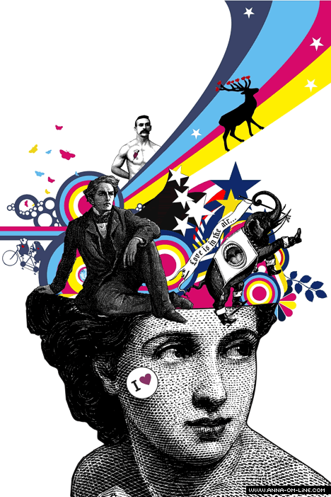
Tone : the qualities of this picture show vary of tone and color, because there are so many different colors, and different shapes. This poster is big enough to determine what they are advertising. It is showing a new scientist with a lot of designs in his brain. The tone of the poster is from very light then to very dark at the bottom.
Tone & Color : The designer set the tone and color by adding very bright colors to the top and very dark color at the bottom of the poster. The setting is like a invisible line and separated in between, so you can understand what's the meaning of the poster.
Color : Why a lot of poster have to use bright color is because they want to catch the everyone's eye to look at it. I'm sure of one poster of white and gray colors and another with colorful bright colors stick in a subway station, the people will notice more on the colorful poster more than the dark poster.
Color & Scale :the pattern matters too. They want the people to notice the upper part first then on the face because the upper part is with colorful tone and color and the bottom is just a dark face. And the poster is designed like there are a lot of designs,sketches,drawings and pictures pop-out in the brain that no more spaces can load.
No comments:
Post a Comment